Identity Standards

https://www.mhkinsurance.com/wp-content/uploads/2017/01/MHK_BrandAssets.zip" download="BrandStandards-Files.zip">Download All Files

Introduction

The MHK Insurance brand aesthetic celebrates it’s roots and heritage, while recognizing the important link between the organization and it’s clients. It is bold, simple and clean, and helps convey the level of professionalism and integrity MHK has come to be known for over the last 100 years.

For any questions regarding the application of the brand, please contact:

Chris Miller
Director, Strategic Initiatives
cmiller@mhkinsurance.com
586.525.6037

12316–107 Avenue
Edmonton AB
T5M 1Z1 Canada
Corporate Logo

Clear Space Agreement

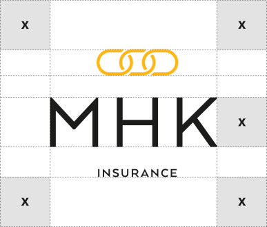
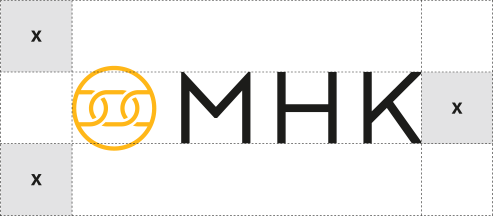
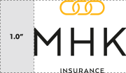
Always maintain the minimum clear space around the MHK Insurance logo. The minimum protective space is X, where X is equal to the negative space in the logo. This space is required around all sides of the logo – including background edges and trims.

MINIMUM SIZE

Minimum size refers to the smallest at which the logo may be reproduced to ensure its legibility.

Colors & Photography

Color Values

Yellow
Pantone® 1235C for coated stock
Pantone® 129U for uncoated stock
C0  M20  Y82  K0    #ffbf3e

Black
C0 M0  Y0  K100    #1b1b1a

Light Blue
C57  M36  Y11  K0    #6e85ab

Dark Blue
C100  M73  Y39  K19    #083a5a

Dark Grey
C74  M62  Y62  K38    #3c3c3c

Light Grey
C16  M12  Y11  K0    #cccccc

MHK Insurance is represented in two (2) principal colours, and four (4) secondary colours. The main yellow colour has a corresponding Pantone® value used for high quality printing. All colours have the indicated four-colour process (CMYK) breakdown and a Hex value specifically for online use.

These colours are important to the brand identity system and must never be adjusted.

Photo Treatment

To maintain consistency in tone and colour for the MHK Insurance brand, a unique photo treatment has been developed. Colour photography should be treated with the “MHK_PhotoTreatment” Photoshop action.

Typography

Type Usage

The following two (2) typefaces should be used for all MHK Insurance applications. The use of these typefaces will maintain a consistent and cohesive appearance on all materials.

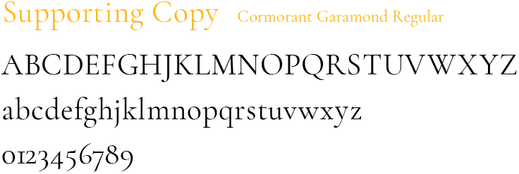
Arquitecta Bold should be used for all headlines. Cormorant Garamond Regular should be used for all supporting copy including subheadlines. Font variants include alternate weights and oblique.

Type should be set in black on white, or white on darker colours. For larger headlines the Yellow (PMS1235) can be used. In greyscale applications, type should be set in black.

Limited Type Usage

When working with PC (Windows system) desktop communication media, such as Word™ or other Office™ templates, the fonts listed below can be used in place. Although these are adequate substitutions, they should only be used in situations where the primary typefaces are not available.